- guide for visual, motion, and interaction design
- material design specification
- material degisn io
1 Get Stared
theme, layouts, elevation, widgets, animation
1.1 Apply the Material Theme
- specify a style inheriting from
android:Theme.Material -
provide updated system widgets that let you set color palette and default animations
 <!-- res/values/styles.xml -->
 <style name="AppTheme" parent="android:Theme.Material" />
1.2 Design Your Layouts
- conform to the
material design guidelines - pay attention to the following :
Baseline grids, Keylines, Spacing, Touch target size, Layout structure
1.3 Specify Elevation in Your Views
android:elevation="5dp"to determine the size of view’s shadow and its drawing order- elevation changes when responding to touch gesture
1.4 Create Lists and Cards
- create
android.support.v7.widget.CardViewand setcard_view:cardCornerRadiusto show pieces of information inside cards with a consistent look across apps
1.5 Customize Your Animations
startActivity(intent, ActivityOptions.makeSceneTransitionAnimation(this).toBundle());
2 Using the Material Theme
- apply md styles
- provide : system widgets for color palette, touch feedback animations for system widgets and activity tranistion animations
- material theme :
Theme.Material(dark version),Theme.Material.Light(light version),Theme.Material.Light.DarkActionBar - v7 Support Libraries
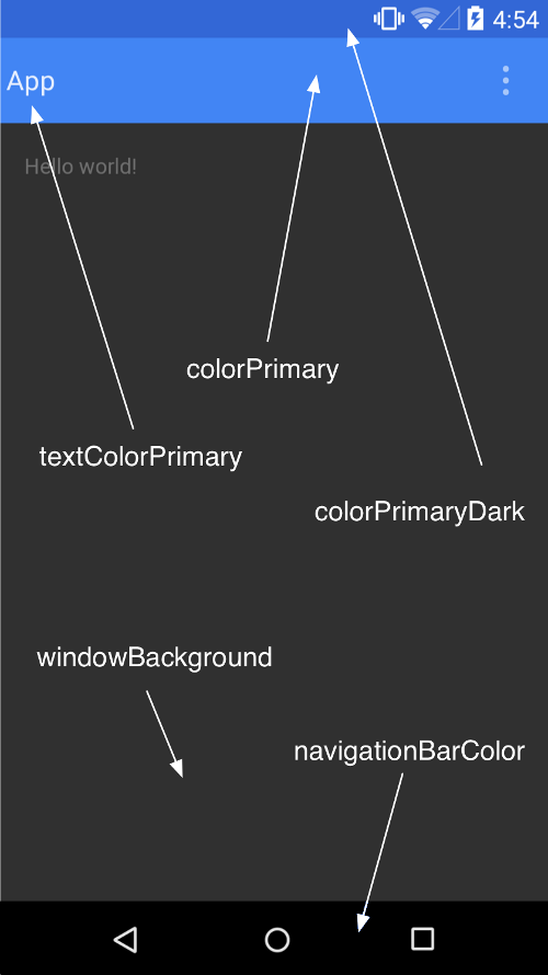
2.1 Customize the Color Palette
<!-- inherit from the material theme -->
  <style name="AppTheme" parent="android:Theme.Material">
    <!-- Main theme colors -->
    <!--   your app branding color for the app bar -->
    <item name="android:colorPrimary">@color/primary</item>
    <!--   darker variant for the status bar and contextual app bars -->
    <item name="android:colorPrimaryDark">@color/primary_dark</item>
    <!--   theme UI controls like checkboxes and text fields -->
    <item name="android:colorAccent">@color/accent</item>
  </style>
2.2 Customize the Status Bar
- specify a color to fit your brand and provide enough contrast to show the white status icons
android:statusBarColorinherits the value ofandroid:colorPrimaryDarkWindow.setStatusBarColor()- customize the material theme
2.3 Theme Individual Views
- specify
android:theme
3 Creating Lists and Cards
- with a consisitent look and feel using system widget
- use
RecyclerView, CardViewto create complex lists and cars with md styles
3.1 Create Lists
- create
RecyclerView, built-in layout managers :LinearLayoutManager,GridLayoutManagerandStaggeredGridLayoutManager - create an adapter that extends
RecyclerView.Adapter<RecyclerView.ViewHolder> - customize these animations extend the
RecyclerView.ItemAnimatoror useRecyclerView.setItemAnimator()
3.2 Create Cards
CardViewextends theFrameLayoutclassCardViewwidgets can have shadows and rounded corners- CardView
3.3 Add Depenencies
compile 'com.android.support:cardview-v7:21.0.+',compile 'com.android.support:recyclerview-v7:21.0.+'
4 Defining Shadows and Clipping Views
- create elevation for your views
- focus user’s attention to the task at hand
- views with higher Z values cast larger, softer shadows
- view clipping
- Objects in 3D space
4.1 Assign Elevation to Your Views
- Z = elevation + translationZ
android:elevationorView.setElevation()to set the elevation of a viewView.setTranslationZ()to set the translation of a view, orViewPropertyAnimatior.translationZ()
4.2 Customize View Shadows and Outlines
- the bounds of a view’s background drawable determine the dafault shape of its shadow,
android:background Outlinesrepresent the outer shape of a graphics object and define the ripple area for touch feedback- verride default shape of the view’s shadow, define a custom outline for a view :
- extend the
ViewOutlineProviderclass - override the
getOutline()method View.setOutlineProvider()to assign the outline provider
- extend the
- create oval and rect outlines with rounded corners using
Outlineclass
4.3 Clip Views
- easily change the shape of a view, use
View.setClipToOutline()orandroid:clipToOutline Outline.canClip()to create rectangle, circle, and round rectangle outlinesView.setClipToOutline()to set the background drawableRevealEffectanimation
5 Working with Drawable
- create vector drawable and tinit drawable resources
5.1 Tint Drawable Resources
- tint bitmaps, nine-patches defined as alpha mask
BitmapDrawable,NinePatchDrawableandVectorDrawablewithsetTint()android:tint,android:tintMode
5.2 Extract Prominent Colors from an Image
- extract colors : vibrant, muted
Palette.generate()orPalette.generateAsync()- depenencies
compile 'com.android.support:palette-v7:21.0.0' - Palette
5.3 Create Vector Drawables
SVG Path referenceAnimating Vector Drawable
6 Defining Custom Animations
- transitions with shared elements
- Touch feedback, Circular reveal, activity transitions, curved motion, view state changes
6.1 Customize Touch Feedback
- RippleDrawable
?android:attr/selectableItemBackground指定有界的波纹?android:attr/selectableItemBackgroundBorderless指定越过视图边界的波纹。 它将由一个非空背景的视图的最近父项所绘制和设定边界android:colorControlHighlight指定一种颜色
6.2 Use the Reveal Effect
ViewAnimationUtil.createCircularReveal()show or hide a group of UI elements
// previously invisible view
View myView = findViewById(R.id.my_view);

// get the center for the clipping circle
int cx = myView.getWidth() / 2;
int cy = myView.getHeight() / 2;

// get the final radius for the clipping circle
float finalRadius = (float) Math.hypot(cx, cy);
float initialRadius = finalRadius;

// create the animator for this view (the start radius is zero)
Animator anim = ViewAnimationUtils.createCircularReveal(myView, cx, cy, 0, finalRadius);

anim = ViewAnimationUtils.createCircularReveal(myView, cx, cy, initialRadius, 0);

// make the view visible and start the animation
myView.setVisibility(View.VISIBLE);
anim.start();
7 Maintaining Compatibility
7.1 Define Alternative Styles
- older theme
res/values/styles.xml - md theme
res/values-v21/styles.xml
7.2 Provide Alternative Layouts
- res/layout-21/xx
7.3 Use the Support Library
- API21+
RecyclerView,CardView,Palette
7.3.1 System widgets
Theme.AppCompatthemes provide MD styles forEditText, Spinner, Checkbox, RadioButton, SwitchCompat, CheckedTextView
7.3.2 Color Palette
<!-- extend one of the Theme.AppCompat themes -->
<style name="Theme.MyTheme" parent="Theme.AppCompat.Light">
    <!-- customize the color palette -->
    <item name="colorPrimary">@color/material_blue_500</item>
    <item name="colorPrimaryDark">@color/material_blue_700</item>
    <item name="colorAccent">@color/material_green_A200</item>
</style>
7.3.3 Lists and Cards
RecylerViewandCardView
7.3.4 Dependencies
dependencies {
    compile 'com.android.support:appcompat-v7:26.0.1'
    compile 'com.android.support:cardview-v7:26.0.1'
    compile 'com.android.support:recyclerview-v7:26.0.1'
}
7.4 Check the System Version
- Activity transitions
- Touch feedback
- Reveal animations
- Path-based animations
8 Selecting Colors with the Palette API
- select colors using the v7 Palette library
9 Using the Design Support Library
- create components including the navigation drawer
9.1 Add the Dependency
compile 'com.android.support:design:26.0.1'
9.2 Create a Floating Action Button
FloatingActionButton——FAB extendsImageButton- customize a variety of aspects of the button, including its size, placement, and appearance
9.3 Create a Navigation Drawer
- a drawer layout
- a drawer header layout
- a drawer menu layout